Sobok
Sobok offers the finest tea grown in Jeju, inviting those immersed in busy city life to nurture their well-being and rediscover their true essence. Each cup creates a quiet moment to reconnect with oneself and return to a natural sense of balance. As customers enjoy Sobok tea, the brand accompanies them on a journey toward serene happiness, bringing relaxation, joy, and a healthier rhythm to everyday life.
Project Type:
Branding
Role:
Brand Identity & Visual Design
Industry:
Premium Tea / Beverage
Scope:
Brand Naming, Brand Strategy, Logo Design, Visual Identity, Packaging Design, Digital & Print Assets
Year:
2024
Brand Overview
'Sobok' offers the finest tea grown in Jeju, providing an opportunity for those immersed in the hustle and bustle of city life to nurture their health and rediscover their essence. Each cup of tea serves as a precious moment for our customers to reconnect with their forgotten selves and return to their true nature. As customers enjoy our tea, Sobok accompanies them on a journey to find serene happiness in their daily lives, helping them experience joy, relaxation, and healthful living.

Brand Naming
'So' signifies the essence, and 'Sobok' conjures up an image of gently accumulating snow, evoking a tranquil scene of sipping tea in winter for customers. Moreover, 'Sobok', which also means a dense growth of plants, can symbolize the richness and diversity of tea. The term 'Rim', representing a lush grove of tea trees, is added to this, delivering a message focusing on nature, abundance, and the essence of tea.

Brand Slogan
"Jeju's Finest Purity" Sobok is a premium tea brand that focuses on the essence, selling tea grown directly from tea leaves in the pristine, snow-covered mid-mountain regions. Unlike existing tea brands that solely focus on the image of green tea in summer, Sobok emphasizes the tranquil image of tea in winter, positioning itself to have a compelling competitive advantage in the market.

Brand Core Value and Essence
1. Pureness: We deliver genuine purity to our customers through tea derived from the pristine nature of Jeju. 2. Quality: We promise superior quality to our customers through the finest tea grown in Jeju. 3. Essence: Through a cup of tea, we provide our customers with the leisure to return to their essence and focus on nurturing their health. 4. Enlightenment: We aid in personal growth and change, offering new insights to our customers through the rich color changes of tea.

Brand Visual Principle
1. Snow: 'Snow' symbolizes purity and cleanliness. 'Sobok' tea, derived from the pure nature of Jeju, offers customers an authentic taste and aroma. 2. Silver: 'Silver' signifies luxury and elegance. Its shimmer also brings bright energy to customers. 3. Gradient: The gradient evokes a snowfall scene, illustrates personal growth and change, and portrays the rich color variations of tea. 4. Blur: The blur effect symbolizes the blurring out of surrounding noise and focusing on the important essence.


Brand Symbol
For the brand name "Sobokrim", a unique snow mountain symbol was designed using the English name 'sobok's' first letter 's' and three circles. By adding 's' to the snow mountain, it evokes the image of a leaf while giving a sophisticated feel. Subsequently, a contemporary snowflake icon in varying thicknesses was added above the snow mountain, expressing the luxury of a premium brand. These design elements reinforce Sobok's brand identity and provide customers with a luxurious brand experience.

Brand Logo
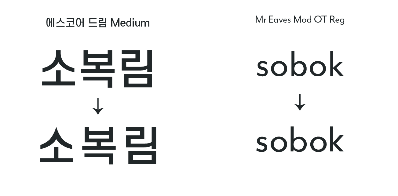
To emphasize the essential values of the 'Sobok' brand, a sans-serif typeface with minimal decoration was used. This not only builds a modern and professional image but also effectively reveals the identity of the premium tea brand 'Sobok'. It also gives a neat and succinct feel that well reflects the meaning of the word 'Sobok'. The shape of 'ㅅ' was modified to a pointy end to recall Sobok's 'mountain' symbol. For the English font, a typeface with round circle shapes and smooth line thickness was used. The circular form of 'b' was rounded, and 'k' was modified to a perfect symmetrical shape to create consistency with the Sobok symbol. This completes a brand logo that well represents the purity and luxury of the tea from Jeju.

Brand Color
Sobok's main color, dark navy, gives a deep and calm feeling, emphasizing the brand's message that customers can escape the chaos of daily life and find inner peace through a cup of tea. Moreover, this color symbolizes trust and professionalism, enhancing customer trust in the high-quality tea that 'Sobok' offers. The light sky blue, adjusted brighter from dark navy, symbolizes purity and tranquility. This color evokes the clear and blue sky of Jeju, representing the pure taste and scent of 'Sobok' tea derived from unpolluted nature. The silver color adds a sense of luxury and sophistication, emphasizing the premium brand image of 'Sobok'. This color reveals the brand's sensual aspect and is used to express the meticulous details of the tea.


Package Design for Green Tea Collection
Various colors of tea were delicately represented using gradients against the deep and calm dark navy color of Sobok. This beautifully depicts the various color changes of tea and creates a visual effect resembling falling snow. Moreover, the natural shape of a circle was arranged in varying sizes to directly express a snowy landscape, also adding a feeling of twinkling stars. The gradient was applied in the same colors as the tea to emphasize naturalness. The addition of a silver line accentuates the luxury of the premium tea brand, giving a feeling of receiving a gift. This design simultaneously expresses the purity and luxury of the 'Sobok' brand, offering a special experience to customers.


Package Design for Herb Tea Collection
The 'Sobok' herbal tea collection specifically uses a light sky blue as the background color. This evokes a blue sky and clear water, emphasizing a pure and serene image. Also, the gradient of sky blue and yellow visually expresses the warm flavor and scent unique to herbal tea, through which customers can experience the special taste and aroma of 'Sobok's' herbal tea.

Package Design for Premium Woojeon tea
The 'Woojeon Tea', a premium product collection of 'Sobok', uses a deep and rich brown color for differentiation. This color pairs well with the unique color of the roasted tea, emphasizing the product's uniqueness. In addition, the product's luxury is further highlighted through the use of a bright gold color. The addition of design elements in the shape of a snowflake resembling light gives the product a premium feel. Such a design plays a crucial role in conveying the quality and elegance of 'Woojeon Tea' to customers.

Package Design for Blended Tea Collection
The blended tea collection of 'Sobok' is represented with a variety of colors that symbolize the taste of each tea. The delicate lines drawing the shape of the ingredients were portrayed in a white color containing snow, giving a beautiful impression. This allows customers to focus on the essence of tea while also experiencing unique visual pleasure, emphasizing the special flavor of the blended tea. Additionally, the free arrangement of circular shapes in this design adds a twinkling feeling. This emphasizes the modern and sensual image of 'Sobok' blended tea, signifying the provision of a new tea experience to customers considering not only the taste and scent of tea but also the design.