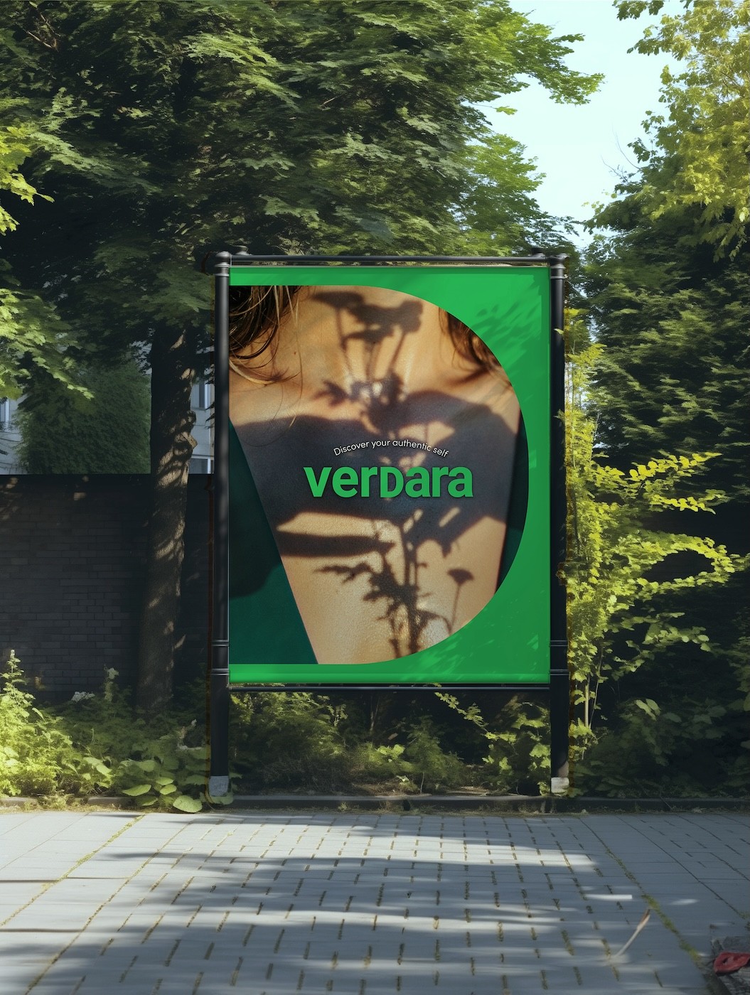
VERDARA
"Verdara" symbolizes a garden of nature's freshest elements, curated specially for skincare, and a place for individuals to grow into their authentic selves. It embodies the brand's dedication to harnessing and delivering the power of nature for skin health, growth, and self-authenticity.
Project Type:
Branding
Role:
Brand Identity & Visual Design
Industry:
Skincare
Scope:
Brand Naming, Brand Storytelling, Visual Identity, Logo Design, Packaging Design, Digital & Print Assets
Year:
2024
Brand Naming
The name is a fusion of "verdant," signifying lush, green vegetation, and the suffix "-ara." "Verdant" symbolizes the brand's commitment not only to encapsulating the freshness of nature in its skincare products but also to promoting the growth and transformation of individuals. This aligns with the brand's mission to support each person's journey towards their 'authentic self'. The "-ara" part can be interpreted as "a place of" or "a collection of." Therefore, "Verdara" can be understood as "a garden of verdant," indicating a place where individuals can nurture their authenticity, akin to how a garden nurtures its plants. It brings forth the brand's intent to be a sanctuary for nurturing one's 'authentic self'.
Logo Design
In line with its proactive and progressive approach to nature, the brand logo was designed using a weighty sans-serif font. However, it incorporates the asymmetry of nature, with the spacing between letters progressively narrowing. The freedom, vitality, and the literary aspect of 'journey towards the true self' are expressed through the design of the alphabet 'V' sprouting like a bud.

Conceptual Concept
Verdara embodies the "Essence of Verdancy," capturing the vitality, freshness, and purity of verdant nature to help uncover and nurture your authentic self. Related to 'authentic self', it could symbolize the growth and transformation of individuals as they journey towards their authentic selves. Just like the lush greenery, individuals are full of life, constantly growing and renewing themselves.
Visual Concept
This spirit is visually brought to life through our "Garden of Authenticity," an aesthetic celebration of earthy and lush green hues, symbolizing the natural purity, authenticity, and vitality we infuse into our clean beauty products. It's a space for growth, change, and authenticity - just like each person's journey to their 'authentic self'. This garden could symbolize a safe space where individuals are encouraged to grow, change, and ultimately, be true to themselves.


Package Design
The logo design of VerDara integrates the letter 'D' from 'garden', symbolizing the brand's natural essence. The visual element of an arch, reminiscent of an entrance to a garden, is actively utilized in the logo design. This adds an active and liberating sensation to the otherwise static theme of 'nature'. This arch motif is further extended to the packaging design, particularly through emphasizing the arch part of the alphabet 'D'. This consistent use of the arch not only strengthens the brand identity but also suggests an invitation to a new experience, reinforcing the dynamic and energetic image of the brand.


Target market
For targeting the North American market, we applied a package design that incorporates additional colors and emphasizes a bold feeling. I've incorporated a 'D' shape to evoke the feeling of a gift box.